
| 일 | 월 | 화 | 수 | 목 | 금 | 토 |
|---|---|---|---|---|---|---|
| 1 | 2 | 3 | 4 | |||
| 5 | 6 | 7 | 8 | 9 | 10 | 11 |
| 12 | 13 | 14 | 15 | 16 | 17 | 18 |
| 19 | 20 | 21 | 22 | 23 | 24 | 25 |
| 26 | 27 | 28 | 29 | 30 |
- Kaggle
- Java
- 파이썬
- SVM
- 생명정보학
- 자바
- 인공지능 수학
- HMM
- 바이오파이썬
- BLaST
- 인공지능
- 이항분포
- 캐글
- 딥러닝
- RNN
- 시그모이드
- bioinformatics
- COVID
- 바이오인포매틱스
- MERS
- ncbi
- AP Computer Science A
- 생물정보학
- 서열정렬
- CNN
- 블록체인
- 인공신경망
- 오류역전파
- AP
- 결정트리
- Today
- Total
데이터 과학
캐글, 상태 추출 예제 본문
캐글에 있는 소스 자료로 내용을 보면 간단한 통계학 분야 이론을 접목한 프로그램 내용입니다.
그리 어렵지 않아서 소개합니다.
아래 링크로 가서 읽어보면 되는 내용인데 아래에는 소스를 보고 간단하게 스크립트도 해 놨습니다.
캐글에 가면 좋은 예제들이 많이 있습니다. 여러번 따라해 보면서 실습을 해보면 실력향상에 도움이 많이 됩니다.
https://www.kaggle.com/code/nkitgupta/feature-engineering-and-feature-selection/notebook
Feature Engineering and Feature Selection
Explore and run machine learning code with Kaggle Notebooks | Using data from multiple data sources
www.kaggle.com
import pandas as pd
import numpy as np
import matplotlib.pyplot as plt
import seaborn as sns
df = pd.read_csv("winequality-red.csv")
df.head()
라이브러리와 소스 파일을 불러오는 기본적인 명령어입니다.
from plotly import express as px
import plotly.graph_objects as go
fig = go.Figure(px.box(df, y = 'free sulfur dioxide', title = 'Box Plot of Free Sulfur Dioxide'))
fig.update_layout(title_x=0.5)
fig.show()
박스플롯을 불러오는 방법입니다. 박스플롯에 대한 이론적인 배경입니다.
IQR - 사분위법을 기준으로 이상치(outlier)에 대한 기준도 마련 할 수 있습니다.

fig = go.Figure(px.box(df, y = 'pH', title = 'Box Plot of PH'))
fig.update_layout(title_x=0.5)
fig.show()
fig = go.Figure(px.box(df, y= 'citric acid', title = 'Box Plot of Citric Acid'))
fig.update_layout(title_x=0.5)
fig.show()
히스토그램을 그려봅니다.
from plotly.subplots import make_subplots
import plotly.graph_objects as go
fig = make_subplots(rows=3, cols=1,
subplot_titles=("Histogram of Citric acid","Box Plot for Citric acid", "Violin Plot for Citric acid"))
fig.append_trace(go.Histogram(x = df['citric acid']), row=1, col=1)
fig.append_trace(go.Box(
x=df['citric acid'],
), row=2, col=1)
fig.append_trace(go.Violin(
x= df['citric acid']
), row=3, col=1)
fig.update_layout(height=800, width=np.inf, title_text="Distribution Plots for Attribute citric acid", showlegend=False, title_x = 0.5)
fig.show()
히스토그램과 박스플롯을 그리는 소스입니다.
from plotly.subplots import make_subplots
import plotly.graph_objects as go
fig = make_subplots(rows=3, cols=1,
subplot_titles=("Histogram of Citric acid","Box Plot for Citric acid", "Violin Plot for Citric acid"))
fig.append_trace(go.Histogram(x = df['citric acid']), row=1, col=1)
fig.append_trace(go.Box(
x=df['citric acid'],
), row=2, col=1)
fig.append_trace(go.Violin(
x= df['citric acid']
), row=3, col=1)
fig.update_layout(height=800, width=np.inf, title_text="Distribution Plots for Attribute citric acid", showlegend=False, title_x = 0.5)
fig.show()
아래소스는 히스토그램을 조금 변형시키는 소스로 log 값을 이용해서 범위를 축소 시키는 방법을 가지고 있습니다.
from plotly.subplots import make_subplots
import plotly.graph_objects as go
fig = make_subplots(rows=1, cols=2,
subplot_titles=("Histogram of Sulphates before transformation", "Histogram of Sulphates After transformation"))
fig.append_trace(go.Histogram(x = df['sulphates']), row = 1, col = 1)
fig.append_trace(go.Histogram(x = 1/(np.log(df['sulphates'])), nbinsx=40), row = 1, col = 2)
fig.update_layout(height=600, width= np.inf, title_text="Distribution of Sulphates before and after 1/log(y) transformation", showlegend=False, title_x = 0.5)
fig.show()
from plotly.subplots import make_subplots
import plotly.graph_objects as go
x_density = (df['density'] - df['density'].mean())/df['density'].std()
fig = make_subplots(rows=1, cols=2,
subplot_titles=("Histogram of Density before transformation", "Histogram of Density After transformation"))
fig.append_trace(go.Histogram(x = df['density']), row = 1, col = 1)
fig.append_trace(go.Histogram(x = x_density), row = 1, col = 2)
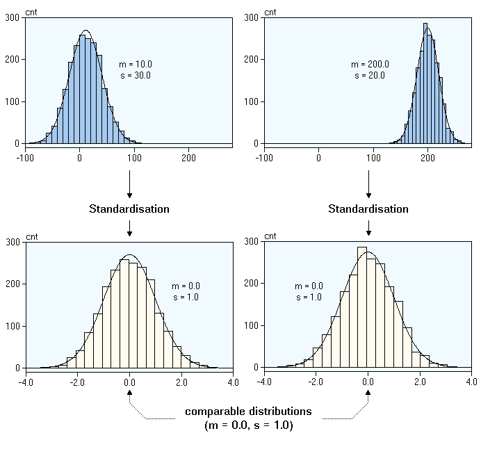
fig.update_layout(height=600, width= np.inf, title_text="Distribution of Density before and after Centring transformation", showlegend=False, title_x = 0.5)
fig.show()
상태추출 내용은 한번 읽어보는게 좋을 것 같습니다.
나중에 컨볼루션 신경망에서도 상태추출 관련 이론은 적용되기도 하고 여러분야에 적용되는 이론입니다.
'Kaggle 데이터 분석, 딥러닝' 카테고리의 다른 글
| 시각화 seaborn (0) | 2022.05.31 |
|---|---|
| 신용카드 채무 불이행 예측 모델 (0) | 2022.05.30 |
| PANDAS 시리즈와 데이터프레임 (0) | 2022.05.03 |
| 타이타닉 생존자 분석 (0) | 2022.01.21 |
| Kaggle에서의 데이터 분석 (0) | 2022.01.02 |
